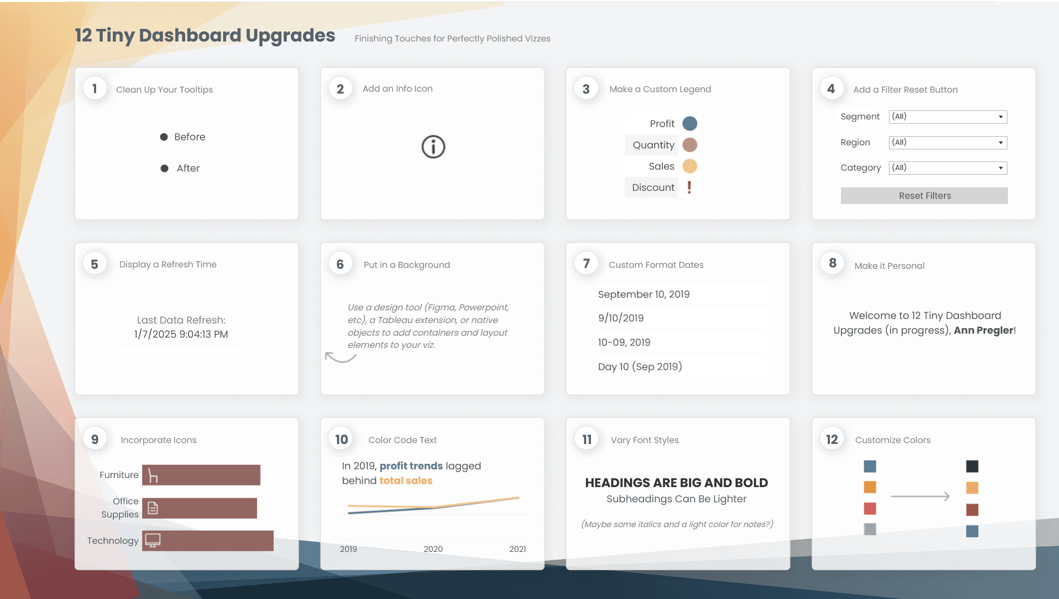
Elevate your dashboards with minimal effort – Ann Pregler introduces 12 tiny but powerful upgrades that can make a huge impact on the clarity, usability, and overall aesthetics of your dashboards. From small tweaks like adjusting spacing and refining tooltips to subtle colour enhancements, these improvements help transform an ordinary dashboard into a polished, user-friendly experience. Best of all, they’re easy to implement, so no major redesigns required!
Great dashboards aren’t just about displaying data; they’re about making insights accessible and engaging. These tips will help you create dashboards that not only look better but also communicate information more effectively. These small changes can lead to big improvements.


