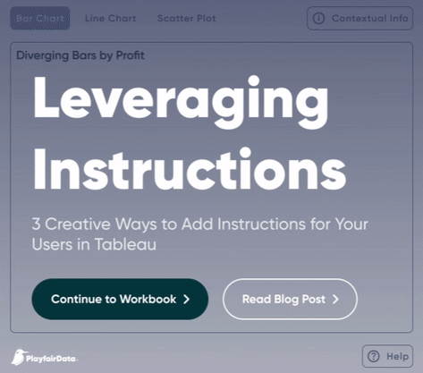
This article, by Jason Penrod, offers innovative techniques to enhance user experience within Tableau, providing practical solutions to common challenges faced by dashboard designers. With clear explanations and illustrative examples, he guides readers through each creative method, empowering them to implement these techniques in their own Tableau projects. From using annotations and tooltips to incorporating guided tours and pop-up instructions, this post offers a diverse range of strategies to cater to various user needs and preferences. By incorporating these creative approaches into your Tableau dashboards, you’ll not only improve user satisfaction and comprehension but also enhance the overall effectiveness of your data visualisations.
3 Creative Ways to Add Instructions for Your Users in Tableau
Want to Get Latest Updates and Tips on Tableau Bites Blogs
Sign Up For Newsletter


