The Information Lab’s Tom Pilgrem uses a bar-in-bar chart to demonstrate how to label the longest of a dual-axis bar chart by using some calculations to make your bar-in-bar charts more easier to read.
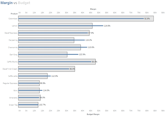

Tableau Training on
Tap Fast Track

Tableau Advanced Analyst

Tableau
Foundation

