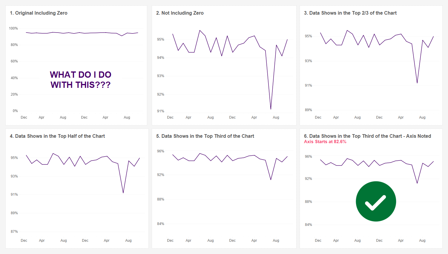
Here in this article by Kevin Flerlage, we are offered a comprehensive guide on when and how to effectively truncate axes in Tableau to enhance the clarity and interpretation- providing insights and practical examples that cater to a diverse range of skill levels, helping you gain confidence and expertise to make informed decisions about axis truncation in their own data visualisation projects.
Kevin’s expertise shines through as he navigates through various scenarios and considerations for axis truncation, providing readers with a well-rounded understanding of this crucial aspect of data visualisation. By addressing common questions and misconceptions surrounding axis truncation, this post empowers readers to approach line chart design with a critical eye and a deeper understanding of the implications of axis truncation on data interpretation.


