This blog by Alyssa Huff brilliantly chronicles the transformation of data presentation from rudimentary charts and graphs to the sophisticated visualisations we use today – offering a compelling narrative that highlights the importance of visual storytelling in making complex information accessible and engaging. It’s an exploration that connects past innovations with current trends and future possibilities. It is both informative and enjoyable to read. By understanding the historical context, readers can better appreciate the tools and techniques available today and perhaps even find inspiration for their own data visualisation projects. Enrich your knowledge and gain a new perspective on how data has been visually interpreted over time. Read on.
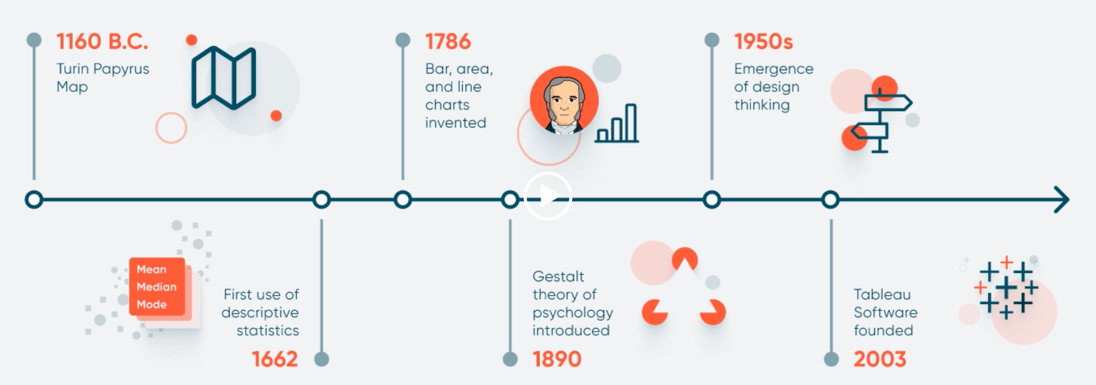

Tableau Training on
Tap Fast Track

Tableau Advanced Analyst

Tableau
Foundation

