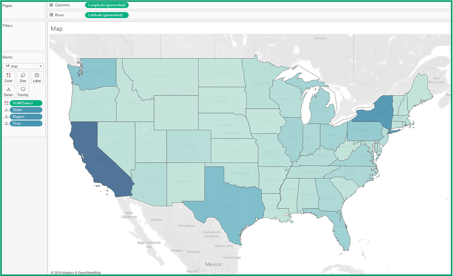
Elevate your Tableau dashboard design by exploring this post by Dawn Harrington. A comprehensive guide essential for anyone looking to enhance the interactivity and functionality of their Tableau visualisations. She walks us through the process of using dynamic zone visibility to create expandable and collapsible views within a container – a technique that can significantly improve the user experience. By following her step-by-step instructions, you’ll learn how to make your dashboards more intuitive and user-friendly, allowing viewers to explore data in a more interactive and engaging manner.
Read on for examples and insights on how to apply this advanced feature effectively. These tips and tricks will empower you to create dashboards that stand out for their interactivity and ease of use.


