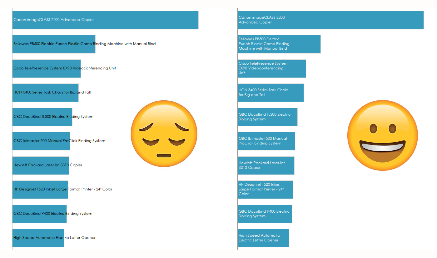
Struggling with text that overflows or gets cut off in your Tableau dashboards? Ken Flerlage has you covered. This in-depth guide walks you through simple yet effective techniques for wrapping text, ensuring that your labels and annotations fit neatly within your visualisations. Whether you’re presenting long category names, detailed descriptions, or any other text-heavy data, Ken helps you make your dashboards cleaner and more readable, enhancing both functionality and aesthetics.
Mastering text wrapping in Tableau can greatly improve how your visualisations communicate insights to your audience. By following Ken’s step-by-step approach, you’ll learn how to avoid cluttered or truncated text, making your charts and graphs easier to interpret. Read on and take a big step toward creating more polished and professional Tableau dashboards!


