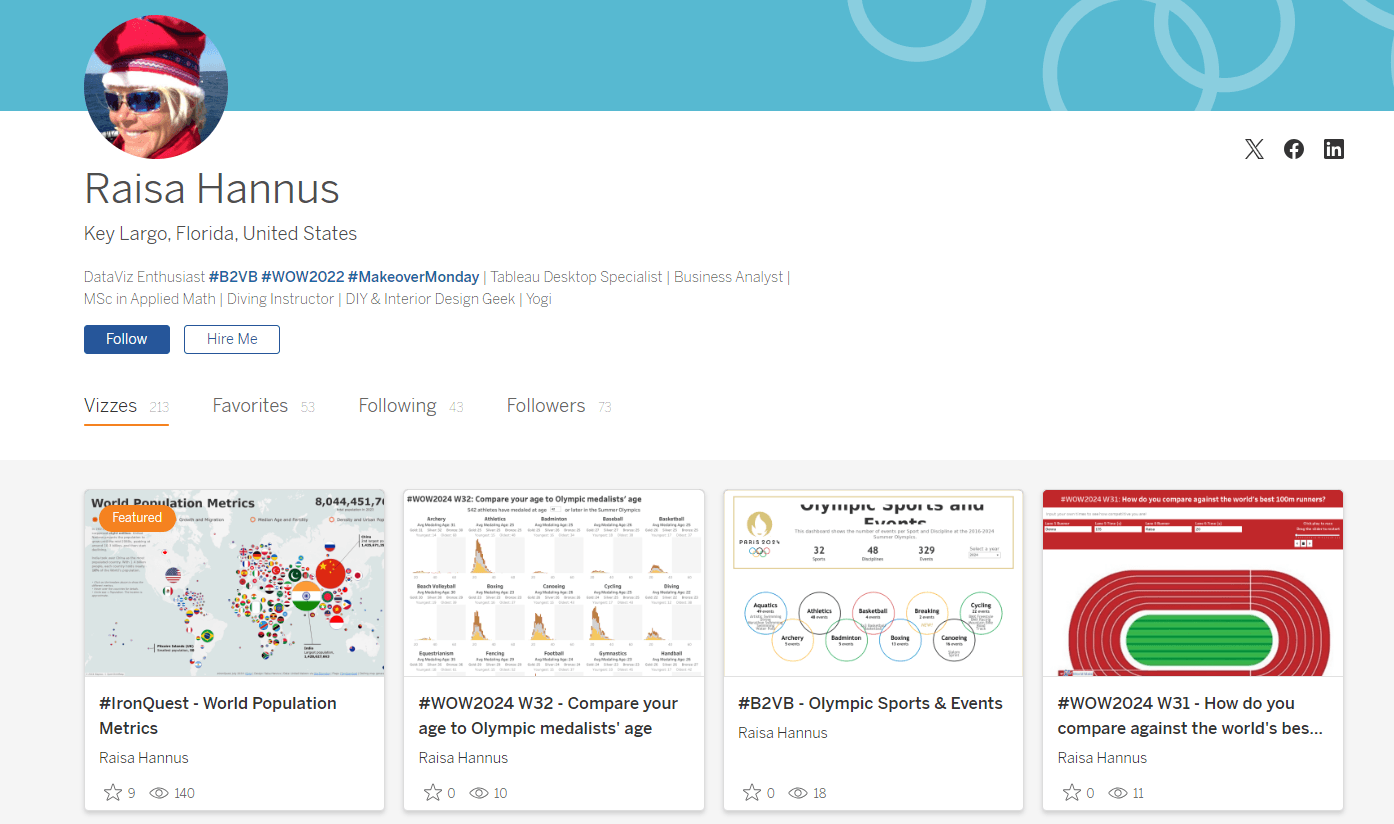
This exciting blog post, by Raisa Hannus (on CJ Mayes’ website) site is an exciting resource you won’t want to miss. It explores the concept of Dorling maps – a creative and visually-striking way to represent geographic data that moves beyond traditional mapping techniques. Raisa expertly breaks down the process of creating these maps in Tableau – offering practical insights and tips that will help you enhance your visual storytelling.
This article will inspire you to think outside the box and consider new methods for presenting your data. It focuses on both the technical and aesthetic aspects of data visualisation. Raisa not only guides you through the steps to create Dorling maps but also discusses the advantages of using this technique to communicate complex data effectively. If you’re eager to learn a unique and impactful way to present your data, this blog post is a must-read.


