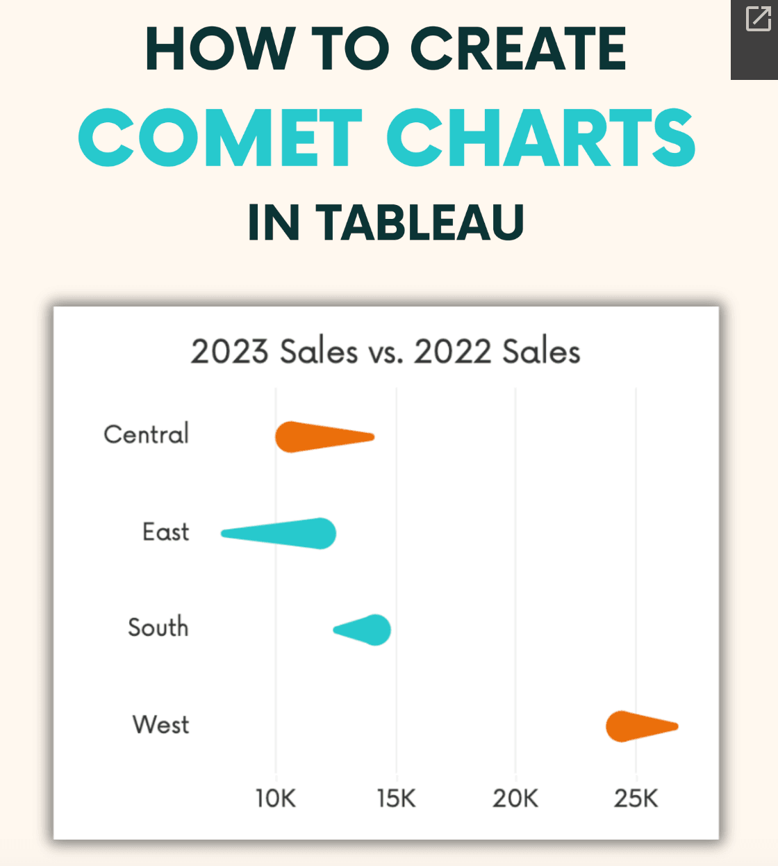
Andy Kriebel’s post introduces the comet chart – a visually striking and effective way to represent trends over time. Unlike traditional charts, comet charts provide a unique perspective by combining elements of line graphs and scatter plots – allowing you to convey historical data alongside future predictions. He breaks down the mechanics of creating a comet chart and discusses its various applications – making it a valuable resource for both seasoned analysts and newcomers to data visualisation. You’ll gain the skills to present your data in a more engaging and informative manner.
As data continues to grow in complexity, effective visualisations become crucial for extracting meaningful insights. The comet chart offers a fresh approach that can help your audience quickly grasp trends and make informed decisions. By reading this post, you’ll not only learn how to create comet charts but also understand their context and impact in real-world scenarios. Don’t miss the chance to elevate your data presentations and captivate your audience with this unique visualisation technique!


