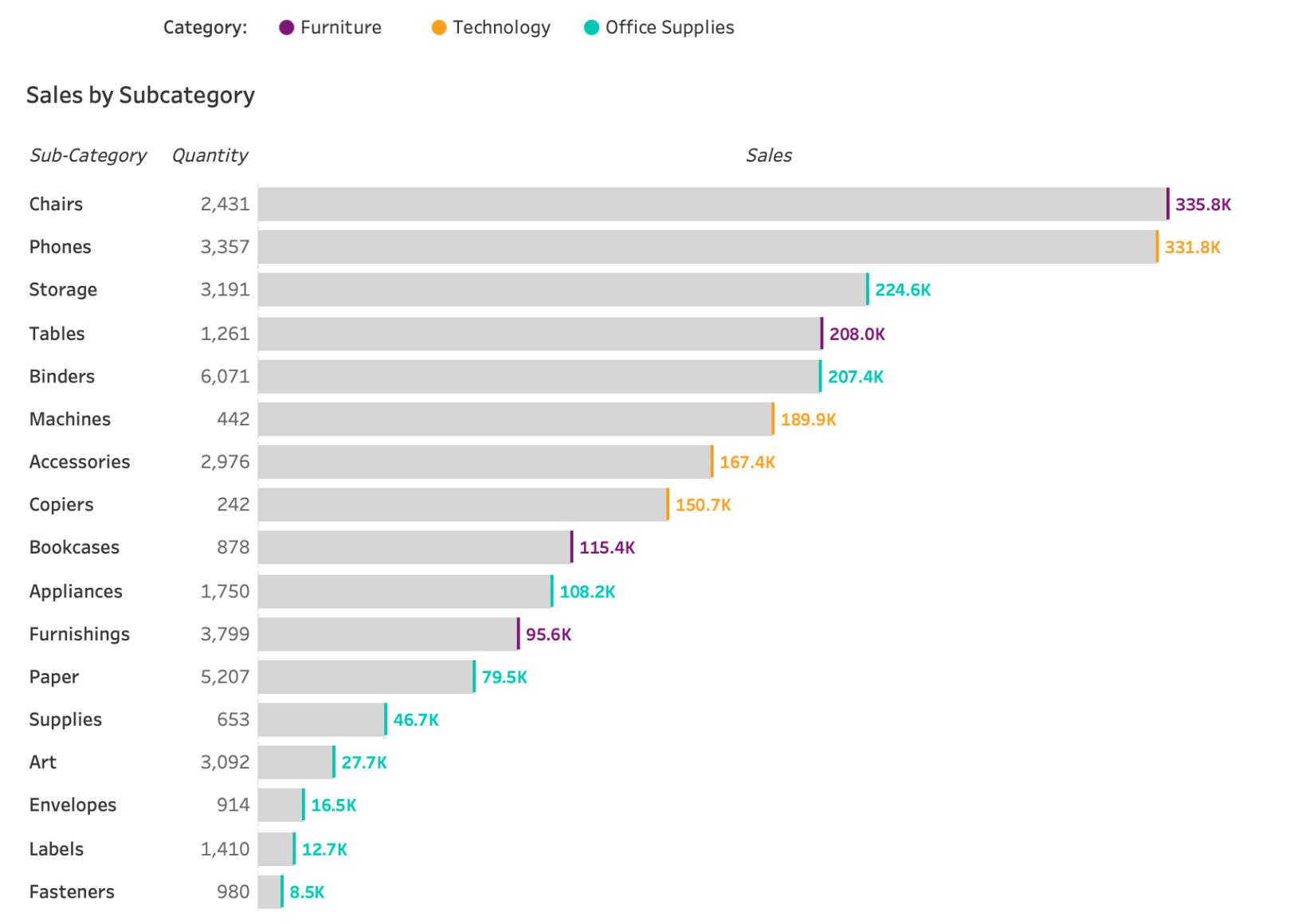
This post, by Lindsay Betzendhal, breaks down a clever technique to emphasise the ends of your bars – making key data points stand out more effectively. You could be presenting performance metrics, tracking progress, or comparing values. – adding this visual distinction can make your charts clearer and more compelling for your audience. The tutorial is easy to follow, ensuring that even if you’re new to Tableau, you’ll be able to implement this enhancement in your own work.
Beyond aesthetics, this approach can also improve the interpretability of your dashboards. Highlighting the ends of bars draws attention to crucial data comparisons, making it easier for users to focus on the most important information. This small tweak can have a big impact on how your audience understands and engages with your visualisations. Read on today and add this skill to your toolkit.


