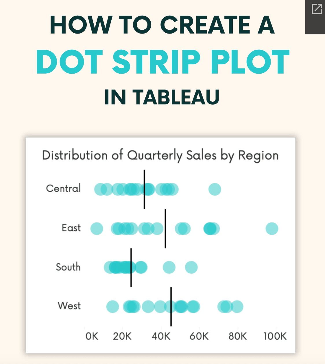
Andy Kriebel‘s post about the dot strip plot is an essential read for anyone serious about improving their data visualisations in Tableau. The dot strip plot is a simple yet powerful way to present comparative data in a clear and engaging manner – helping users quickly identify trends and patterns. In his post, Andy provides a detailed, step-by-step tutorial on how to create this visualisation. It’s a great way to move beyond standard chart types and add creativity to your dashboards.
What makes this guide particularly valuable is how Andy breaks down the reasons behind using a dot strip plot, its advantages over traditional visualisations, and when it’s most effective. It’s more than just a technical tutorial – it’s about improving the way you communicate insights and making data analysis more intuitive and impactful.


