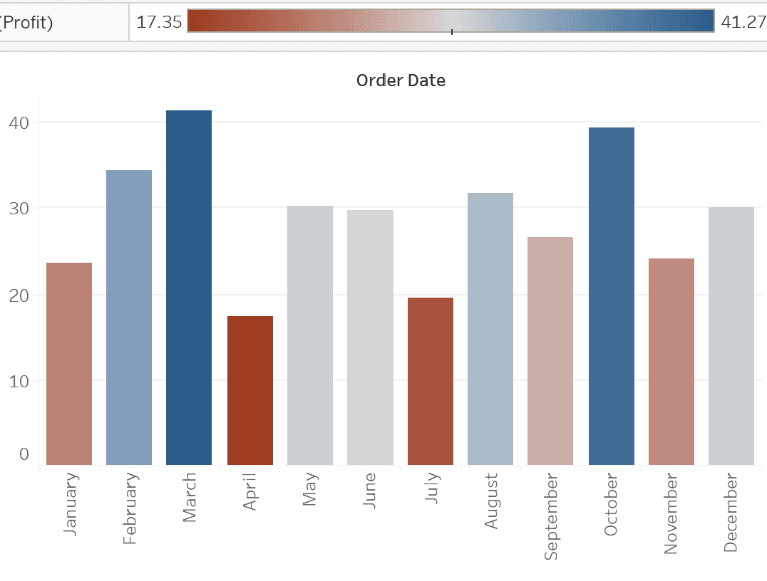
If you’re eager to take your Tableau visualisations to the next level, Ann Pregler‘s article on advanced colour palettes is a fantastic resource. It explores how thoughtful colour choices can dramatically enhance the effectiveness of your dashboards. Ann shares techniques for creating custom colour gradients and applying them in meaningful ways, enabling you to communicate your data more effectively and aesthetically.
The post is not just theoretical; it includes practical examples that encourage experimentation with colour in your own projects. By learning how to implement these advanced techniques, you’ll be able to elevate your visual storytelling – making your data insights clearer and more engaging.


