This insightful piece, by Kevin Flerlage, dives into the nuances of these interactive features – highlighting how they can enhance user engagement and improve the overall experience of your dashboards. By discussing the merits of combining both actions, he offers practical strategies to create more dynamic visualisations that not only convey data effectively but also invite deeper exploration.
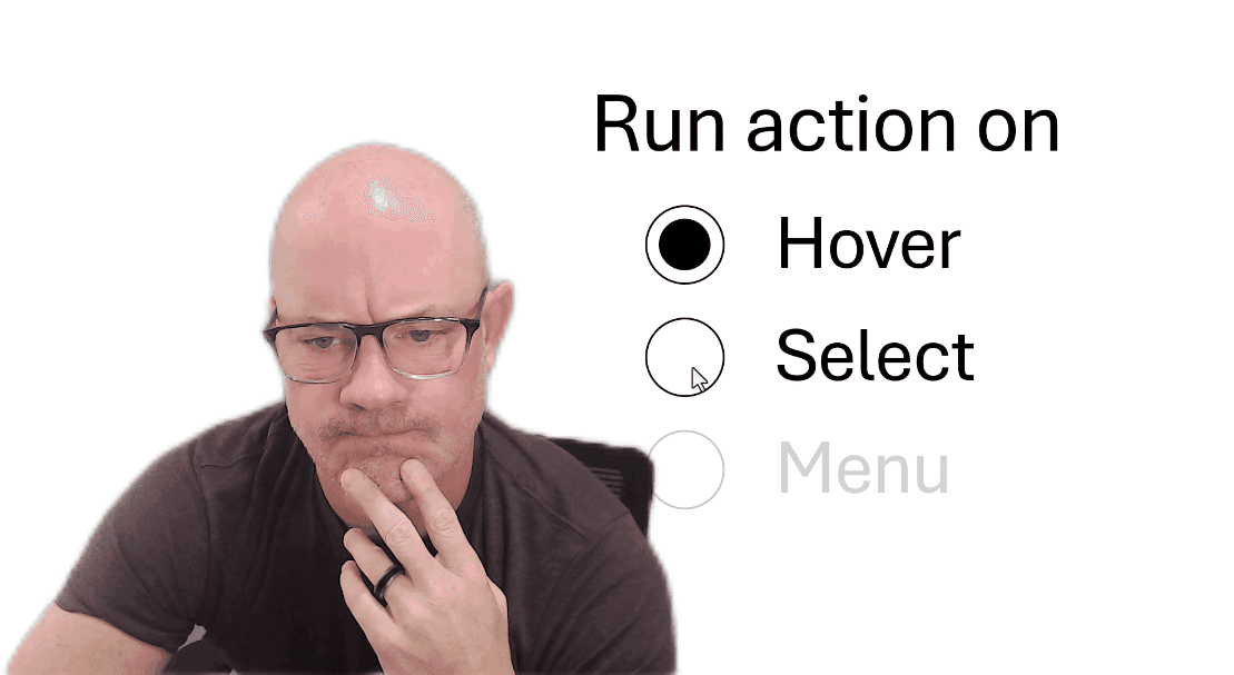
Kevin’s article also emphasises the significance of user interaction in data storytelling. Implementing both select and hover actions allows users to engage with the data in multiple ways, which can lead to richer insights and a more immersive experience. This post is packed with valuable insights and examples. Don’t miss the chance to enhance your Tableau expertise – continue reading on today!


