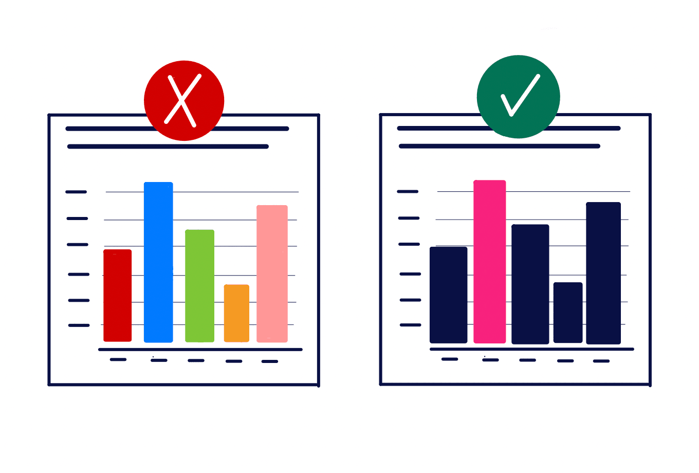
Shaun Davis dives into the key elements of an effective dashboard, helping you create visuals that truly serve their purpose. From choosing the right charts to organising information for maximum impact. These best practices ensure that your dashboards aren’t just functional but engaging and insightful.
Great dashboard design can mean the difference between data-driven decisions and information overload. Shaun’s article provides practical guidance on how to simplify layouts, improve readability, and highlight the most important insights without unnecessary clutter. Create visuals that drive real impact!


