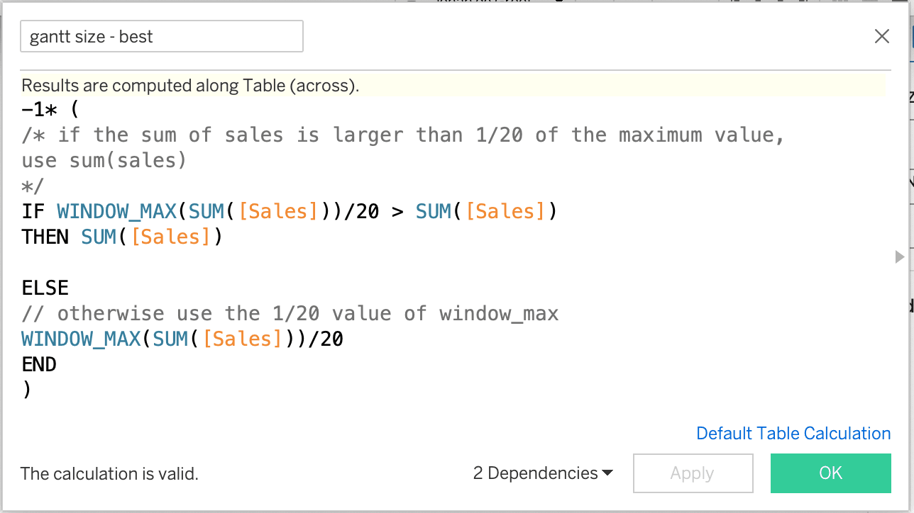
Traditional bar charts often become cluttered or overwhelming, making it difficult for viewers to quickly grasp key insights. The Punctuated Bar Chart offers an innovative solution by emphasising the endpoints of bars, making comparisons clearer and more intuitive. This technique enhances readability and ensures that the most important data points stand out, allowing for better storytelling in your visualisations.
Instead of simply presenting data, Johan de Groot’s post explores how small tweaks – like reducing visual clutter and directing focus – can significantly improve comprehension. This guide will help you elevate your bar charts from ordinary to exceptional. Start applying these expert techniques today!


