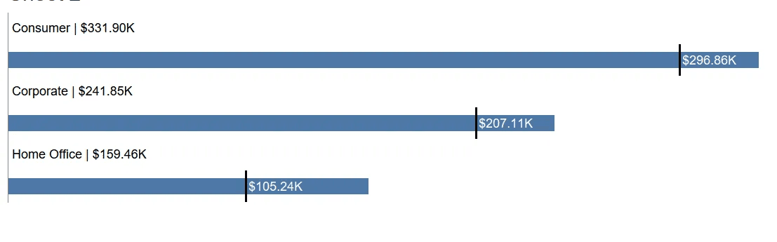
Vignesh Suresh introduces a creative twist on the traditional bar and average line chart by incorporating previous sales data directly into the visualisation. This technique not only makes it easier to compare current performance against historical trends but also provides stakeholders with clearer insights for decision-making.
What makes his post stand out is its practical focus on improving data storytelling. Instead of just displaying numbers, this method helps users immediately grasp performance trends and outliers in a meaningful way.


