Ethan Lang introduces this innovative visualisation technique that blends the power of Sankey charts with bump charts to showcase rankings and movements in a dynamic and clear way. Unlike traditional bar charts or line graphs, the Sankey Bump Chart offers a more engaging view of how data points rank relative to each other across different time periods or measures. Whether you’re tracking sales performance, customer behaviour, or any ranking-based data, this chart can provide a deeper, more insightful analysis.
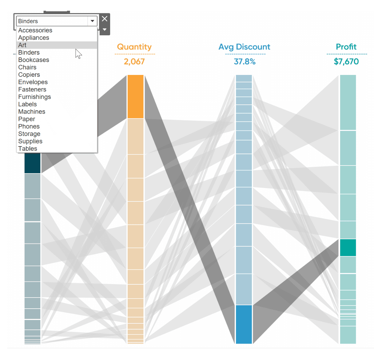

Tableau Training on
Tap Fast Track

Tableau Advanced Analyst

Tableau
Foundation

