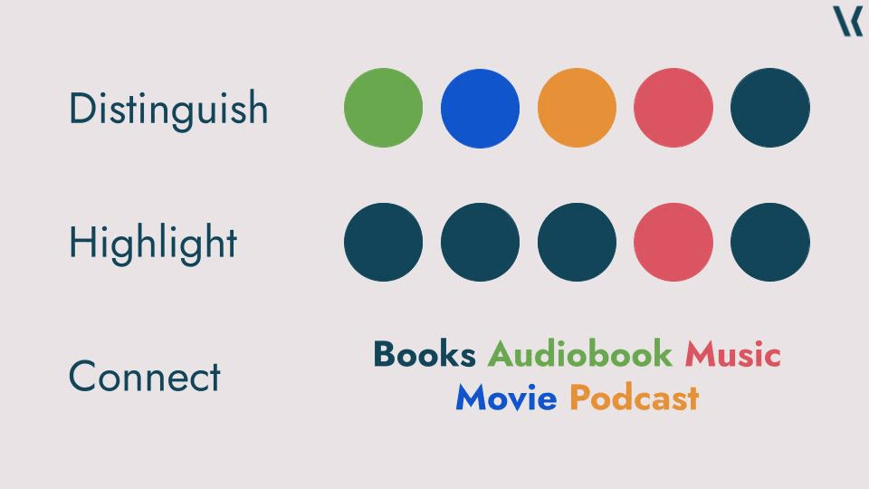
Here is a fascinating exploration of how grey can be effectively used in data visualisations. This article (on Vizku) delves into the concept of using neutral tones to simplify complex visuals and highlight key data points. If you’re looking to refine your colour choices in Tableau dashboards, this post will help you understand when grey can be a powerful tool for clarity and focus.
You’ll gain practical insights into colour psychology, along with examples of how grey can balance data without overwhelming the viewer. It’s a must-read for anyone looking to make their visualisations more effective and pleasing to the eye. Check it out for a deeper dive into the topic!


