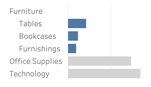
Whether you’re building mobile-friendly dashboards, working with intricate datasets, or simply aiming for a cleaner interface, Johan de Groot’s tips will help you strike the perfect balance between usability and functionality.
Learn how to optimise dashboard space while still providing deep analytical insights – making your visualisations more effective and engaging. Check it out now and refine your approach to interactive data exploration!


