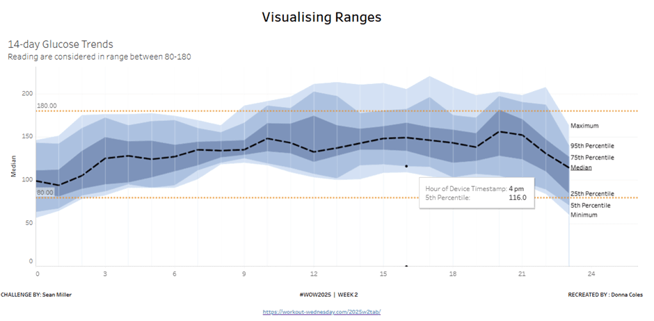
Effectively visualising data ranges is essential for communicating variability and trends in your analysis. Donna Coles provides expert insights on how to do it right. Whether you’re working with financial forecasts, performance metrics, or any dataset where range matters, mastering these visualisation methods will help you tell a more compelling and accurate data story.
Learn how to enhance clarity, avoid common pitfalls, and make your dashboards more intuitive for users. If you want to elevate your Tableau skills and present data with greater precision and impact, this is a resource you can’t afford to miss!


