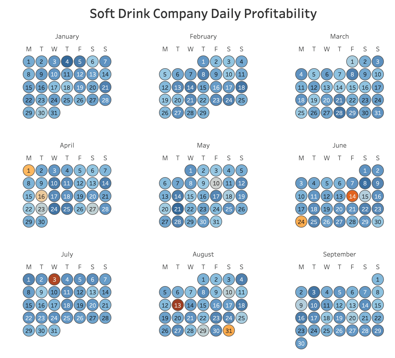
If you’ve ever wanted to visualise time-based data in a clear and interactive way, this post with Andy Kriebel walks you through the process of creating an intuitive calendar view that helps uncover patterns, trends, and anomalies at a glance. Instead of sifting through endless rows of dates, a well-designed calendar can make it easier to track important events, monitor performance over time, and enhance your overall data storytelling.
Andy breaks down the steps to create a Tableau calendar in a way that’s easy to follow and implement. Learn how to structure your data effectively, format your calendar for clarity, and apply interactive features to make it even more user-friendly. Upgrade your dashboards with a visually-appealing and functional calendar!


