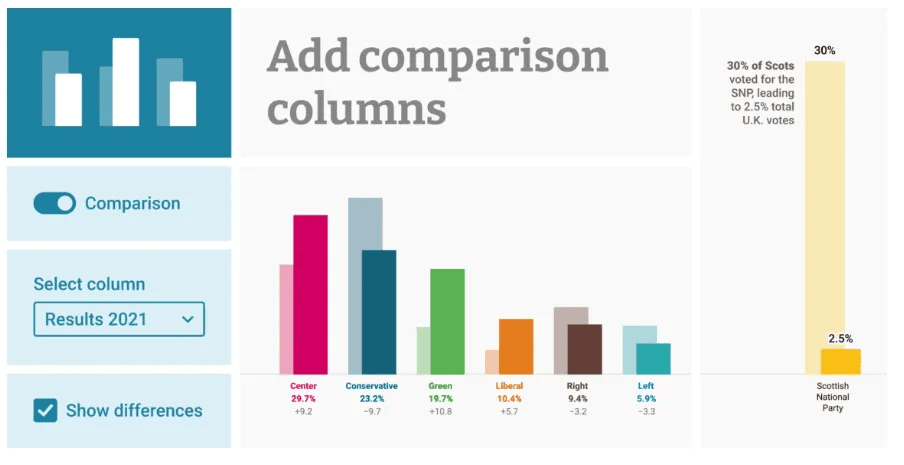
Creating effective comparison visuals in Tableau can be challenging, but Brittany Rosenau has a solution! Here, she introduces a simple yet powerful calculation that allows you to shift and overlap bars seamlessly – making it easy to compare data points side by side – improving readability and storytelling in your dashboards.
This method can be applied across various use cases to enhance clarity and impact. Brittany’s step-by-step explanation ensures that anyone, from beginners to experienced Tableau users, can implement this approach effortlessly. Make your Tableau dashboards more insightful and polished, check it out today!


