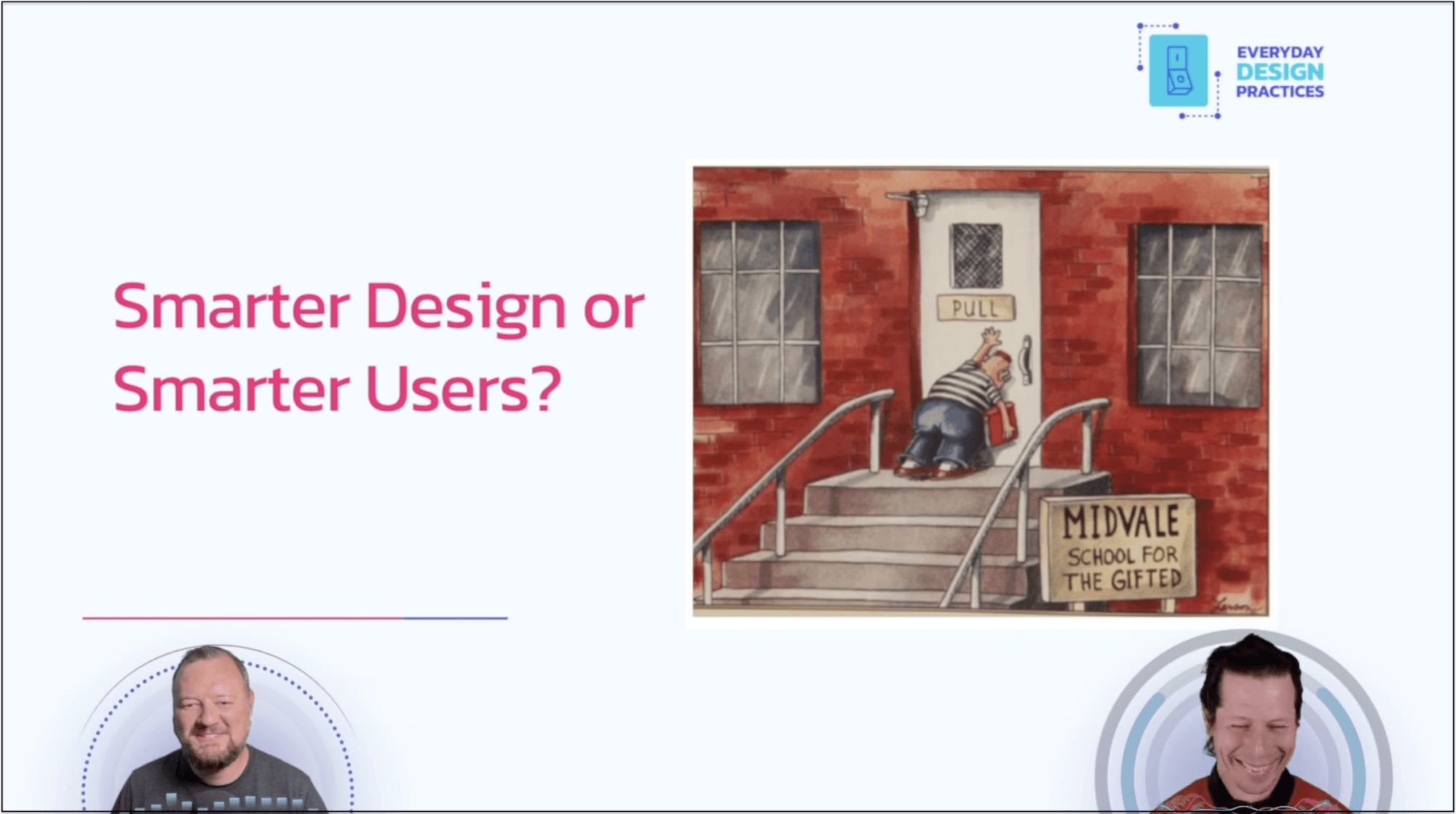
Affordance emphasises intuitive design – ensuring that interactive elements are easily recognisable without the need for instructions. Propositional Density focuses on maximising information conveyance within minimal space – such as using bar charts that encode multiple data dimensions through height, colour, and position. Weight & alignment discusses structuring visual hierarchy to guide the user’s eye naturally, enhancing comprehension and reducing cognitive load.
The article by Keith Helfrich and Robert Rouse illustrates how thoughtful design choices, like consistent visual cues, efficient use of space, and strategic alignment , can significantly improve how users interact with and interpret data. Elevate your work – explore the full article here!


