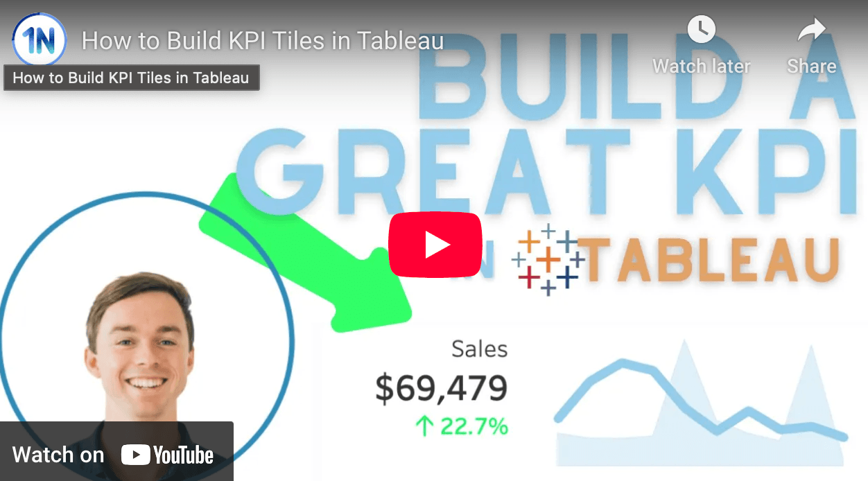
What sets Ollie Linley’s tutorial apart is its practical approach to enhancing dashboard interactivity and readability. He delves into techniques like adding directional arrows to summary tiles, providing month-over-month comparisons, and utilising example Tableau workbooks to illustrate each step. These features not only make your dashboards more informative but also more intuitive for end-users. Become equipped to create KPI tiles that effectively communicate performance metrics and support data-driven decision-making!
How to Build KPI Tiles in Tableau
Want to Get Latest Updates and Tips on Tableau Bites Blogs
Sign Up For Newsletter


