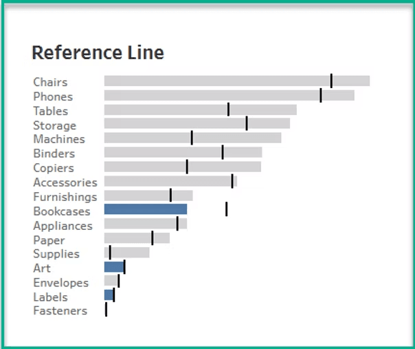
Dawn Harrington‘s breakdown helps us find a smart solution when you want to highlight differences between someone’s performance and the average without clutter or confusion. If you’re aiming to improve how you show comparisons in Tableau – especially for analytics reviews or performance dashboards – this short post offers clear, actionable techniques to elevate your visual storytelling. Read on today!
How Do You Compare?
Want to Get Latest Updates and Tips on Tableau Bites Blogs
Sign Up For Newsletter


