Dawn Harrington (using Steve Adams’ dashboard) takes a real-world example – highlighting this month’s sales compared to last month – and breaks it down with practical steps, including dual axis layering, colour-blind friendly palettes, and enhanced reference line formatting. Whether you’re preparing monthly reporting or presenting trends to stakeholders, this guide offers a polished, insightful way to showcase variance in a dashboard-ready format. Definitely worth checking out!
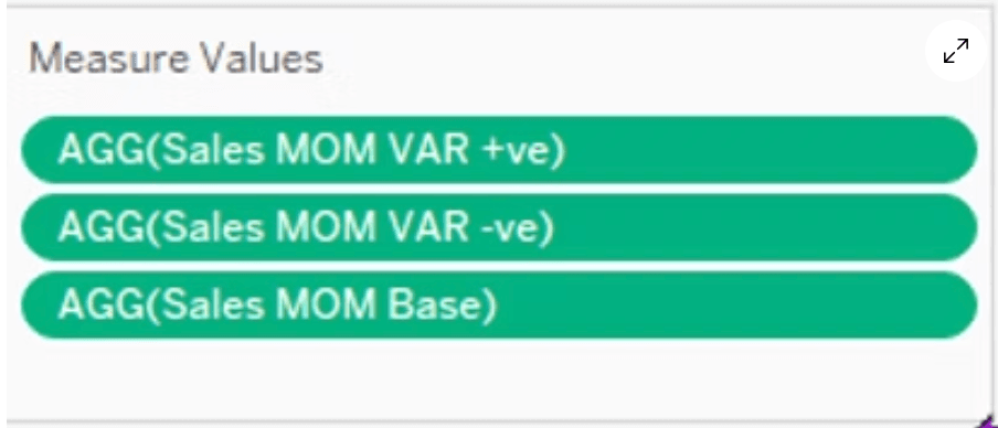

Tableau Training on
Tap Fast Track

Tableau Advanced Analyst

Tableau
Foundation

