Andy Holt’s visualisation sets a high bar for how to present fitness or time-series data in a way that’s intuitive and compelling. If you’re a Tableau creator aiming to refine your chart design or a data storyteller looking for new ideas, Andy’s approach offers a friendly, user-focused interaction that encourages exploration. Dive into this dashboard and discover how small design tweaks can make a big impact!
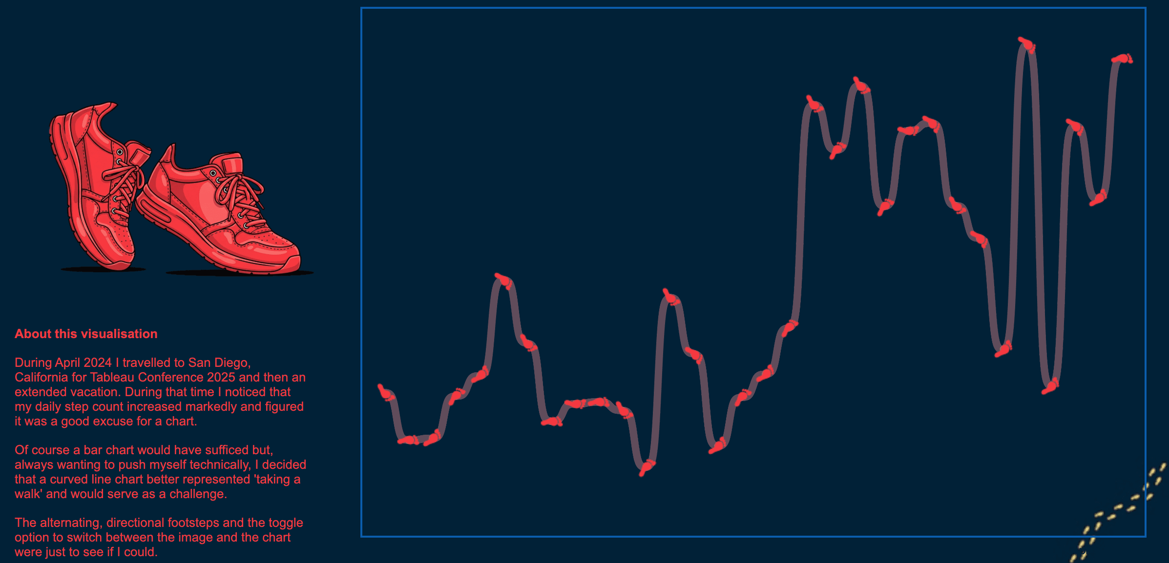

Tableau Training on
Tap Fast Track

Tableau Advanced Analyst

Tableau
Foundation

