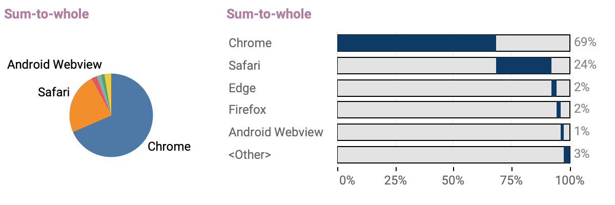
Pie charts might look charming in presentations and reports, but Johan de Groot cheerfully points out that their readability often leaves something to be desired.. Instead, he recommends smart alternatives that preserve the “part-to-whole” message—like embedding a full-length “whole” bar behind your data bar using a dual-axis bar chart in Tableau. It’s a clever trick that keeps your visuals friendly without sacrificing clarity or precision.
Two Pie Chart Alternatives
Want to Get Latest Updates and Tips on Tableau Bites Blogs
Sign Up For Newsletter


