This isn’t just about aesthetics, it’s about deepening your data clarity. By replacing scattered marks with structured, colour-coded hexbins, you instantly improve interpretability and storytelling. Whether you’re exploring geographic distributions or high-volume metric comparisons, Andy Kriebel’s tutorial equips you with a tangible technique to elevate both clarity and impact in your dashboards.
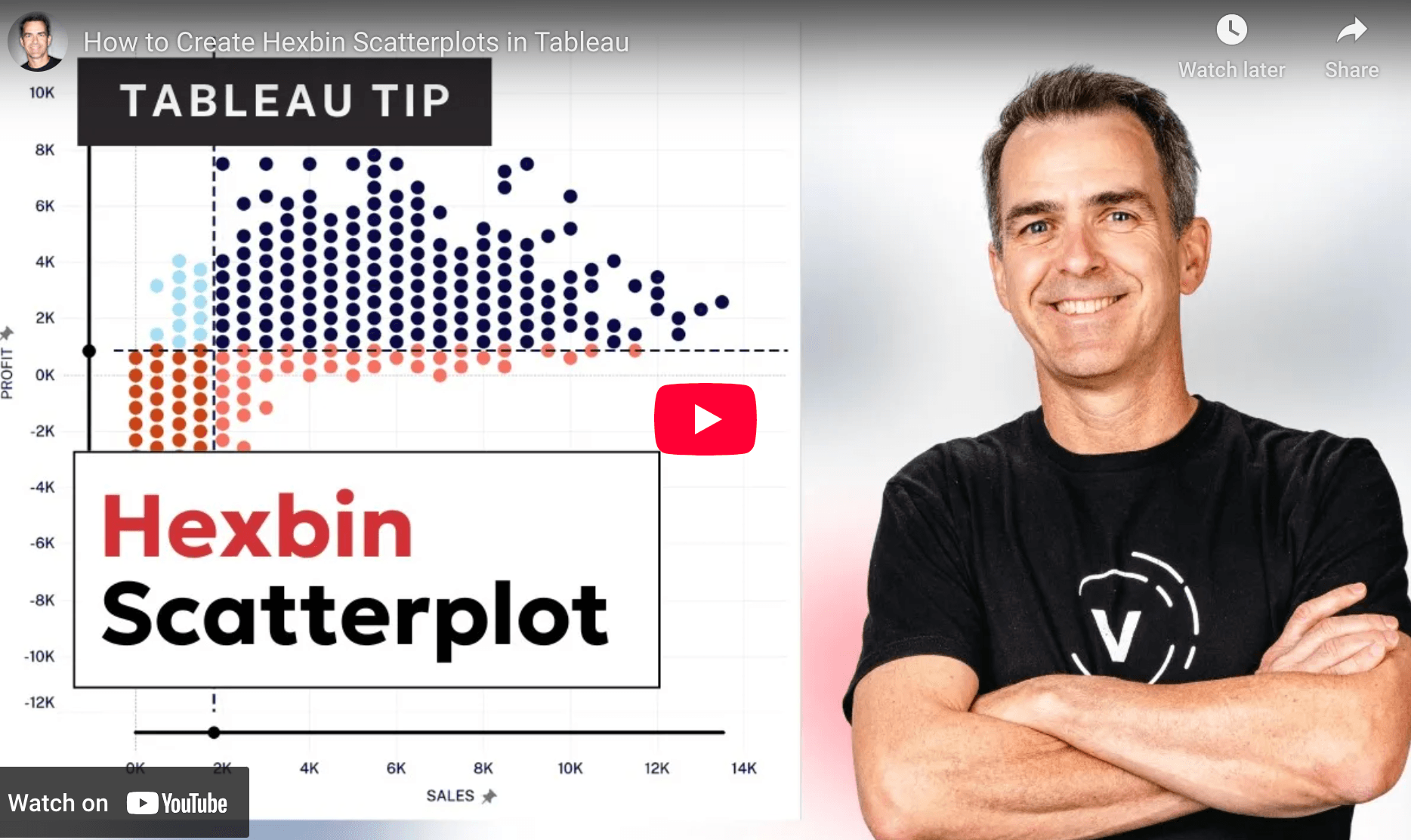

Tableau Training on
Tap Fast Track

Tableau Advanced Analyst

Tableau
Foundation

