Johan de Groot’s post blends thoughtful design reasoning with an actionable example. You’ll not only understand why a visual treatment like the sine-wave animation works (it catches the user’s eye, signals movement, emphasises “not done yet”), but how to build it: data preparation, calculation logic, chart setup – all laid out in a clear way. If you’re working in analytics, dashboard design, or even creating reports where you need to show “live” or “still ongoing” data, this article gives you a clever tool you probably hadn’t considered. Give it a look.
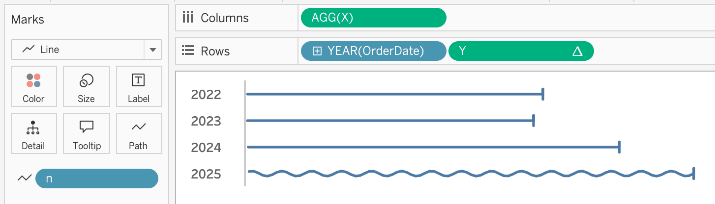

Tableau Training on
Tap Fast Track

Tableau Advanced Analyst

Tableau
Foundation

