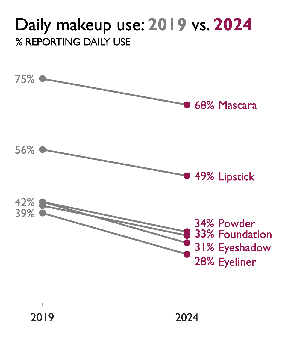
Beyond the mechanics of chart types, Cole Nussbaumer Knaflic invites you to step back and ask: What does my data story need to show? Are you comparing categories at one point in time (bars), or showing how something changes over time (lines)? He reinforces that simplicity often serves surprise best, and that the right choice of visual can make the difference between “just data” and “clear insight.”
When bars win – and when lines do!
Want to Get Latest Updates and Tips on Tableau Bites Blogs
Sign Up For Newsletter


