Beyond the immediate technical how-to, Joseph Hughes‘ post is a great reminder of how small tweaks can make big differences in how users can interact with their dashboards. Learn how to use window functions, parameters, filtering logic and clever colouring to make a dynamic, intuitive interface for end-users – skills that are transferable across many Tableau use-cases.
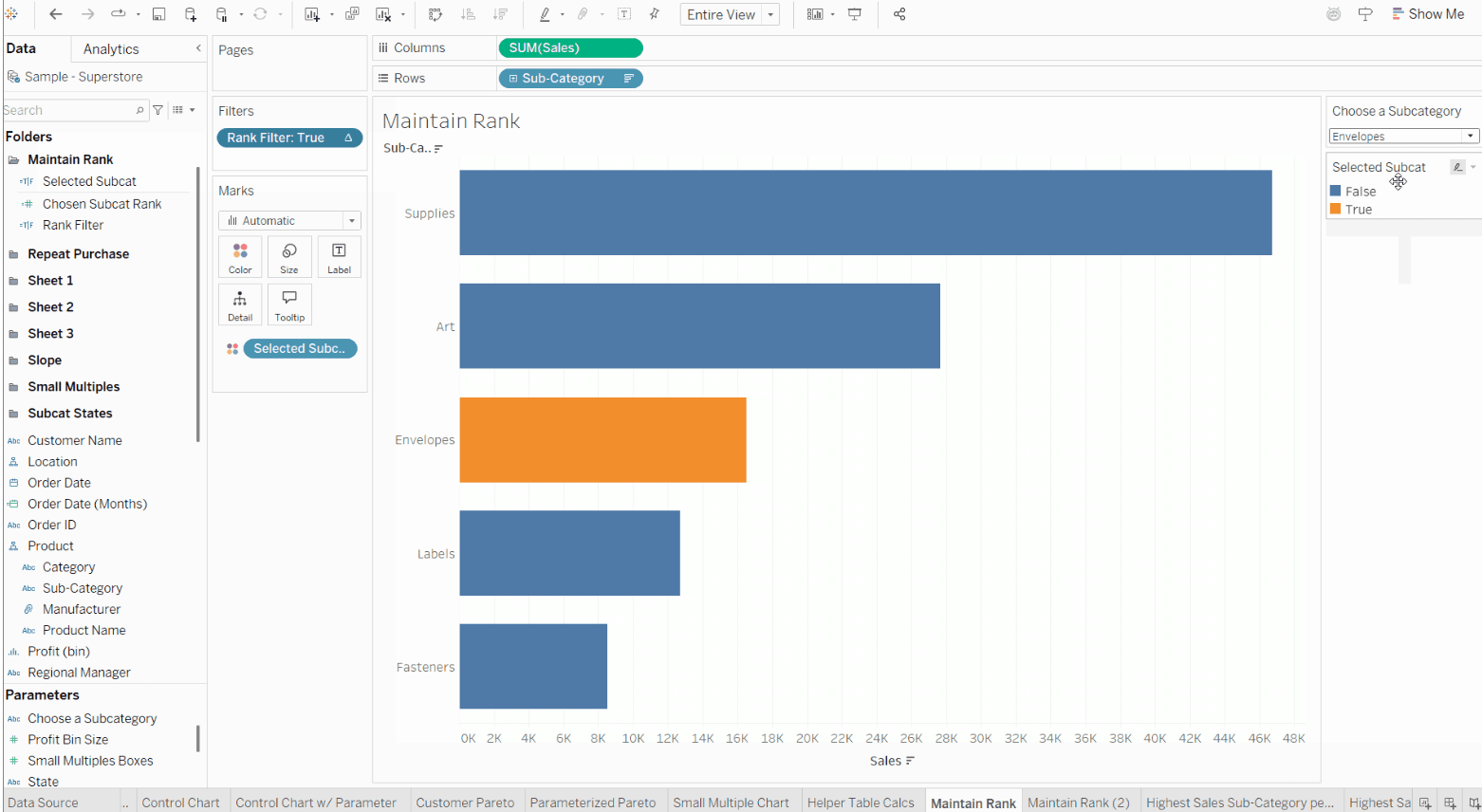

Tableau Training on
Tap Fast Track

Tableau Advanced Analyst

Tableau
Foundation

