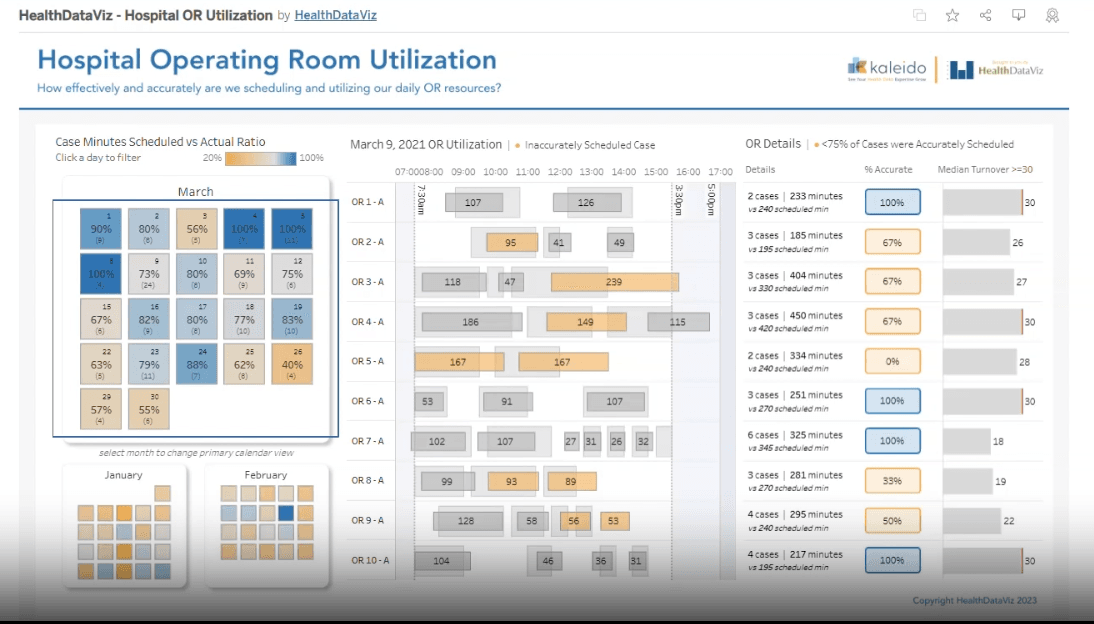
Stephanie Shorey-Roca’s post doesn’t just call out problems, it offers concrete solutions. You’ll get a breakdown of Tableau’s accessibility features: custom alt‑text for rich context, keyboard navigation for exploring charts without a mouse, and even a more legible set of Google fonts for better readability. Here’s both the “why” and the “how” to make your analytics truly inclusive.
Accessible by Design: Making Data Visualization More Inclusive with Tableau
Want to Get Latest Updates and Tips on Tableau Bites Blogs
Sign Up For Newsletter


