Johan de Groot’s article is a window into a deeper data-design mindset – encouraging you to think about what your data really needs: where subtle shifts matter, when absolute values are more meaningful than relative ones, and when prioritising clarity or emphasis makes sense. Be better equipped to judge whether a visualisation is honest, or unintentionally (or intentionally) misleading. This skill turns you from a passive viewer into a savvy data-consumer or creator.
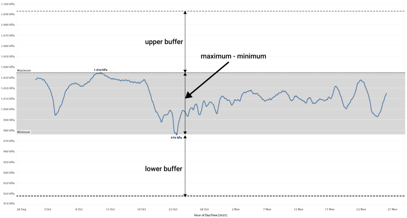

Tableau Training on
Tap Fast Track

Tableau Advanced Analyst

Tableau
Foundation

