Johan de Groot explores a practical way to improve radar charts by balancing overview and detail. The approach focuses on keeping the recognisable shape that makes radar charts appealing while adding techniques that allow users to zoom into individual spokes and better understand specific values. The result is a more readable and analytical chart that preserves context without sacrificing clarity – an idea that’s especially valuable for dashboard designers and Tableau users who want to push beyond basic chart implementations.
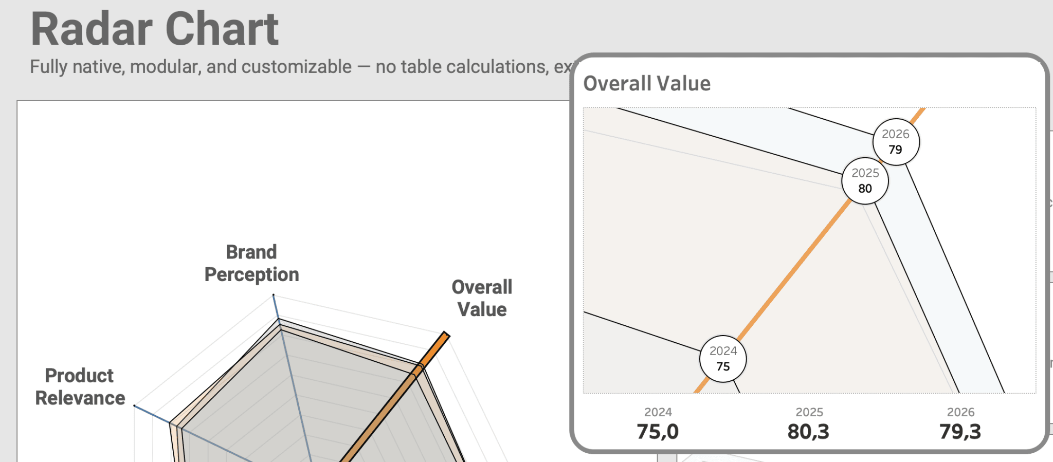

Tableau Training on
Tap Fast Track

Tableau Advanced Analyst

Tableau
Foundation

