Especially interesting, is how it goes beyond aesthetics and encourages data professionals to think more intentionally about design decisions in Tableau. Rounded shapes can make dashboards feel softer and easier to navigate while reinforcing visual grouping and clarity. It’s a great reminder that effective data visualisation isn’t just about charts and calculations – it’s also about thoughtful UI choices that make the entire experience easier and more engaging for your audience. Read on with Luigi Cicciari…
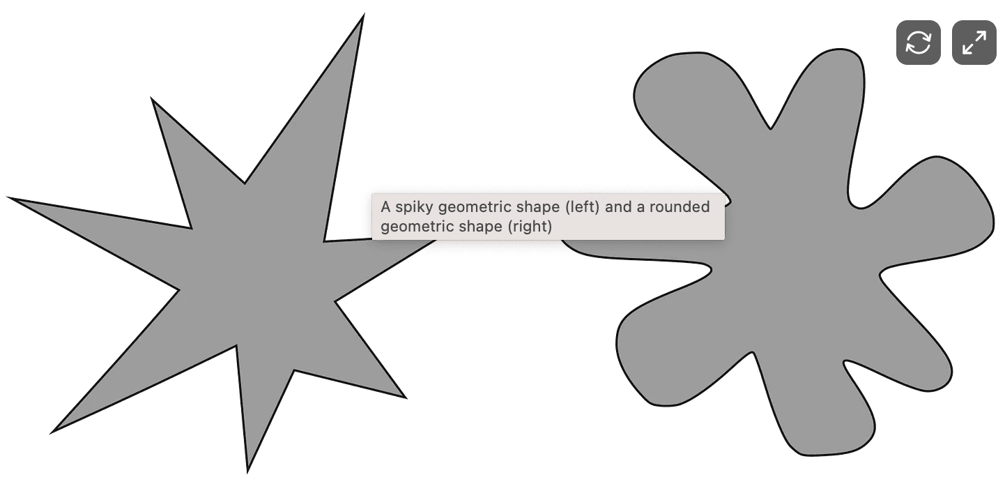

Tableau Training on
Tap Fast Track

Tableau Advanced Analyst

Tableau
Foundation

