Instead of relying on subjective judgment, you can quickly test whether your text and background combinations are actually usable for your audience and adjust accordingly. Strong contrast is a core principle of accessible design, and meeting recommended ratios like 4.5:1 for normal text ensures your visuals are inclusive and easier to read for everyone. It’s a small tool that can significantly improve the clarity and impact of your work. Read on with Jonathan Schwabish.
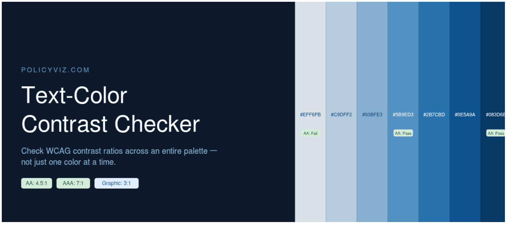

Tableau Training on
Tap Fast Track

Tableau Advanced Analyst

Tableau
Foundation

