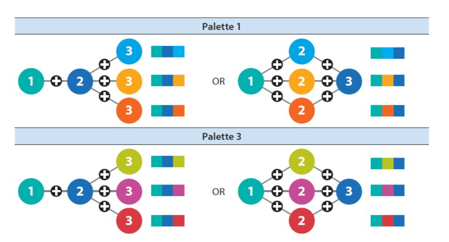
Choosing the right colours can make or break a data visualisation, and Jon Schwabish’s helpful post is a must-read for anyone looking to elevate their visual storytelling. He walks us through the art and science of selecting colour palettes that not only look professional but also enhance the clarity of your charts and dashboards. It’s an invaluable resource for avoiding common pitfalls like overloading your visuals with too many colours or unintentionally creating visual confusion.
What sets this post apart is its emphasis on balance and intentionality. You’ll learn how to create colour schemes that align with your message – ensuring that every shade serves a purpose in drawing attention to insights. Whether you’re a beginner or a seasoned pro, this post offers actionable advice to help you craft visuals that are not only beautiful but also clear and impactful.


