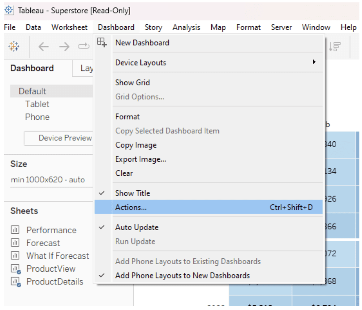
If you’re debating whether Tableau or Power BI is the better tool for your interactive data visualisations, check out this post, by Kirsty Wall, as she dives deep into how both platforms handle dashboard actions – such as filters, highlights, and other interactive features that enhance user experience. By breaking down their strengths and limitations, the article helps you understand which tool is better suited to your needs.
With a clear, side-by-side comparison, you’ll gain valuable insights into how each platform excels in different scenarios. Whether you’re focused on user interaction, performance, or customisation, this article will guide you in choosing the best tool for your projects. Make sure to check out the full breakdown here!


