Steve Wexler’s article provides practical examples – including a comparison of Apple product costs to median monthly incomes – demonstrating how bar-in-bar charts can effectively communicate complex information. Steve’s approach emphasises the importance of choosing appropriate visualisation techniques to accurately represent data, making this a valuable read for anyone involved in data presentation and dashboard design.
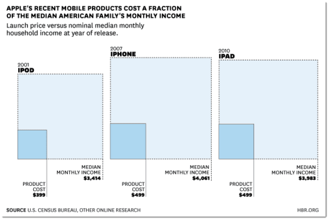

Tableau Training on
Tap Fast Track

Tableau Advanced Analyst

Tableau
Foundation

