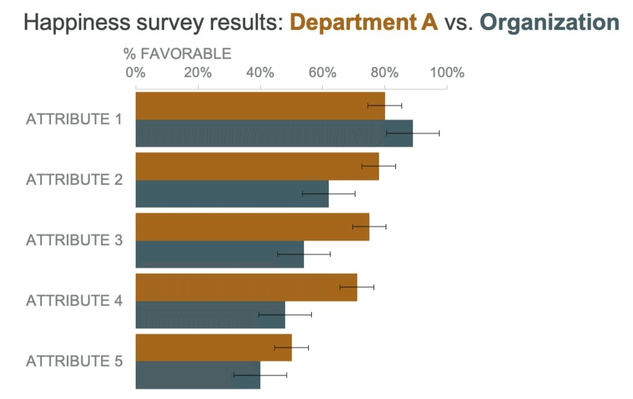
Alex Verez guides us through how error bars can enhance clarity and credibility in your visualisations. Whether you’re working with scientific data, financial metrics, or business analytics, this guide will help you present your findings with greater precision and transparency.
Alex focuses on practical application and by implementing these techniques, you can ensure your audience fully understands the reliability and limitations of your data without unnecessary complexity. If you’re serious about improving your data storytelling and making your charts more meaningful, Alex’s post is a great place to start.


