
From Data to a Story
“There are probably thousands of people more qualified to write about Data Storytelling than I. Though since it’s a topic I love and a topic I teach I will do…
“There are probably thousands of people more qualified to write about Data Storytelling than I. Though since it’s a topic I love and a topic I teach I will do…

Brian Moore talks us through the final part of a series on creating curved elements in Tableau, it also covers new and different techniques… Read Original Article…
Fun With Curves in Tableau Part 3: Sigmoid Curves Read More »
“I love drawing in Tableau and a few months ago, I saw an image of a Sunflower and I wondered if there is a mathematical way to create this…” let’s
Ateken Abla welcomes us to the first DataFam Roundup (of 2022!!) – a weekly blog that brings together community content all in one post Read Original Article…
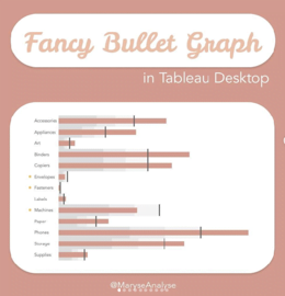
Maryse Analyse says “Today I will show you step by step how to create a Bullet Graph – a graph that can replace the harder to read Gauge chart. It’s
“This week’s theme is inspired by a recent family holiday to Norfolk, where I spent most of my time staring out to sea and shouting “there’s one!” every time a

Maryse Analyse says “Today I will show you step by step how to create a Bullet Graph – a graph that can replace the harder to read Gauge chart. It’s
“Up your viz game – Newbie+ Tableau users if you are past Getting Started and ready to use Tableau to tell stories with your viz…” Jim Dehner goes through a
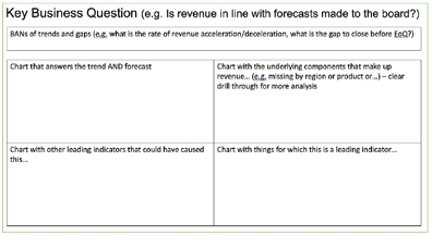
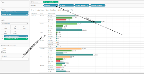
Candice Munroe talks us through the one key question to ask to reduce the number of Key Performance Indicators, and the 5 questions to answer in order to deliver insights
How to get business users to ask better questions of their data Read More »
“We will build a dashboard that allows you to unleash your imagination…” Post by Rosario Gauna. Read Original Article…
