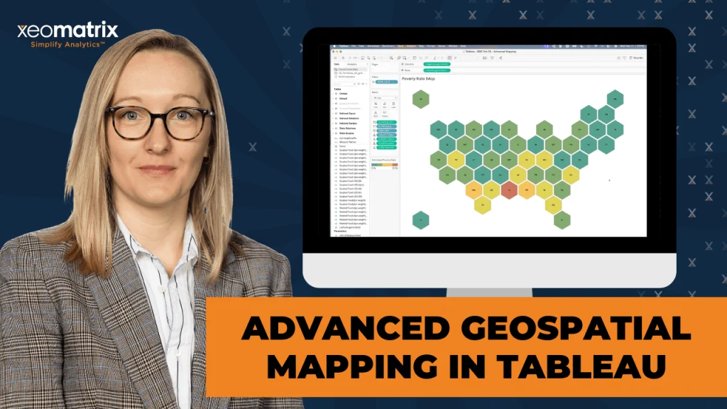
Coloring the Ends of a Bar Chart in Tableau
This post, by Lindsay Betzendhal, breaks down a clever technique to emphasise the ends of your bars – making key data points stand out more effectively. You could be presenting…
This article, by the guys over at Tableau, provides an all-encompassing guide to the most powerful and essential features in Tableau – helping users at every skill level improve their
This insightful post with Steve Wexler breaks down the art of transforming raw data into powerful visuals that communicate complex information in an easily digestible way – helping you explain
This article, by Jim Dehner, is one you shouldn’t miss. His post breaks down the often-overlooked details of formatting – providing tips that can instantly make your visualisations more polished
Jennifer Dawes shares a personal narrative about the profound impact of collaborating with industry leaders in the Tableau community. Through her experiences, you’ll discover how working alongside Tableau elites not
Life with Visionaries: How Working with Tableau Elite Shaped My Data Career Read More »
Andy Kriebel’s post introduces the comet chart – a visually striking and effective way to represent trends over time. Unlike traditional charts, comet charts provide a unique perspective by combining
Dawn Harrington’s post uncovers the many advantages of dot strip plots, which are powerful tools for displaying data distributions and revealing underlying patterns in a clear and concise manner. She
In this article, Garrett Sauls and Sarah Dorfman share expertise on the intricacies of migrating to Tableau Cloud – detailing the strategic advantages it can offer to organisations looking to
InterWorks LA and Tableau Cloud Migration with Sarah Dorfman Read More »
If you’re passionate about data visualisation and eager to stay ahead of the curve, Alexander Waleczek’s post is a must-read. He explores the exciting innovations on the horizon for Tableau
Here, Jennifer Dawes dives into how Tableau can transform raw data into meaningful, visually-compelling narratives that engage and inform. It offers practical techniques for turning complex datasets into clear and
Data Visualization: Transforming Raw Data into Insightful Stories with Tableau Read More »