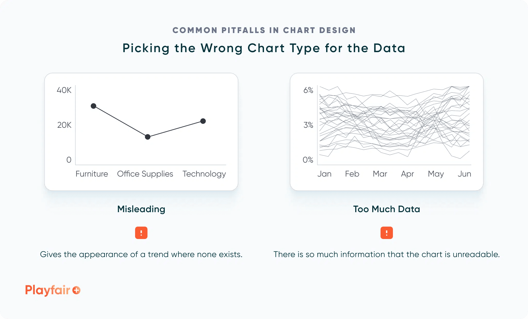
This insightful article, by Alyssa Huff, helps you understand how even the simplest design choices can lead to confusion or misinterpretation of your data. She offers practical advice on creating charts that are both visually appealing and clear, ensuring that your audience gets the right message without any misunderstandings.
Whether you’re a seasoned data professional or just getting started in visual analytics, Alyssa’s guide provides essential tips on fine-tuning your chart design. From selecting the right chart type to ensuring consistency in your visuals, you’ll learn strategies to elevate your presentations and reports. If you want to enhance your ability to tell compelling, accurate data stories, this article will serve as an invaluable resource.


