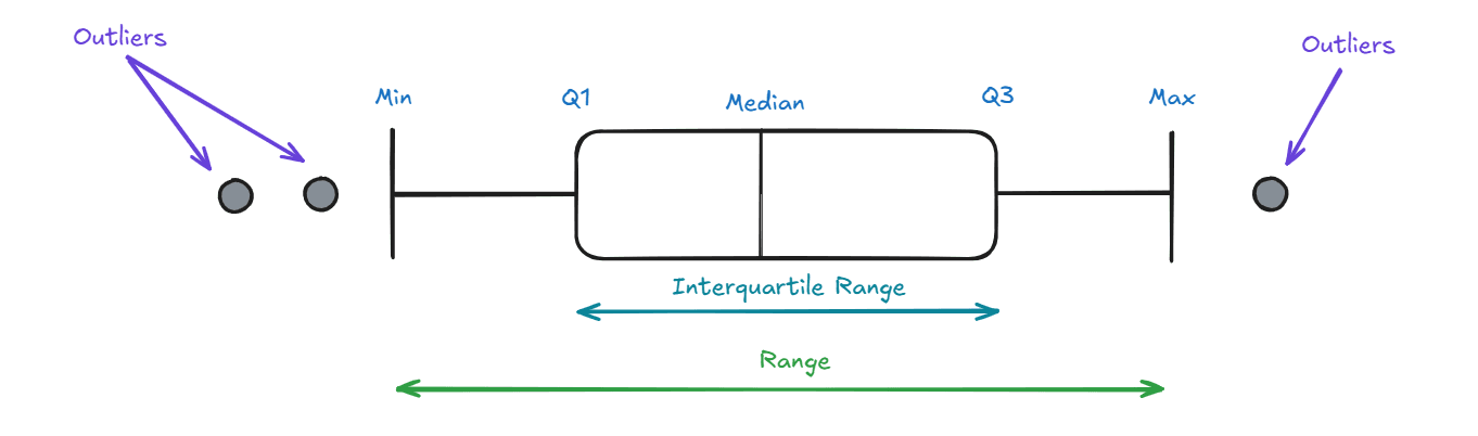
Understanding your data’s distribution is key to making informed decisions, and box plots are one of the best tools for the job! Victor Yuan breaks it down in a way that’s both simple and practical. Whether analysing sales trends, customer feedback, or performance metrics, a box plot helps you quickly identify medians, quartiles, and outliers, giving you a clearer picture of your data’s spread.
Having this tool in your Tableau toolkit will help you present data more effectively and uncover hidden insights that might otherwise go unnoticed. Whether you’re new to box plots or just need a refresher, this guide will give you the confidence to start using them today.


