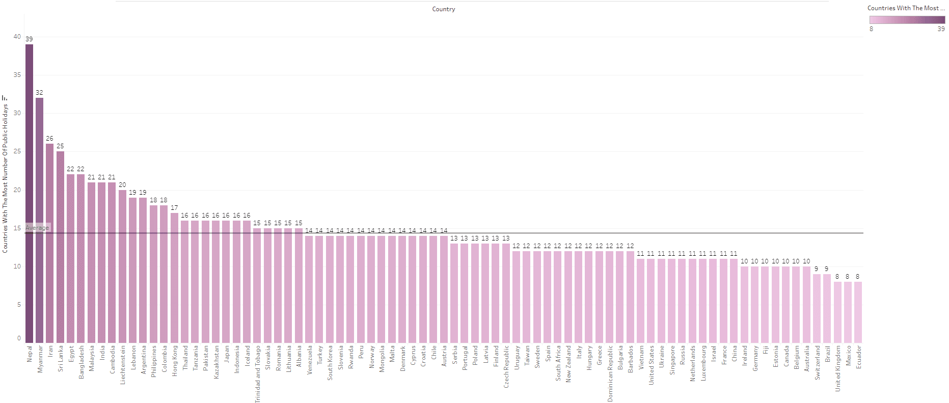
Are you ready to elevate your data visualisation skills and create visuals that captivate and inform? Takhmina Pirmahmadova’s post is a must-read! Her guide explores how to transform a traditional petal chart into a powerful visual storytelling tool – walking you through the process step-by-step, providing not only design tips but also practical techniques to make your visualisations more intuitive and appealing. A perfect resource for anyone who wants to push the boundaries of creativity in data design.
Takhmina demonstrates how a well-thought-out chart makeover can dramatically improve clarity and impact, ensuring your audience fully engages with your data. This post offers inspiration and actionable advice to enhance your visualisation toolkit. Read on and learn how to transform data into compelling stories!


