When people talk about dashboard success, it’s almost always about the “big reveal.” The impressive visuals. The sleek interactions. The perfectly polished charts.
But here’s the thing – the most valuable dashboards I’ve seen don’t rely on a dramatic entrance. They don’t win awards. They don’t even try to impress. What they do, quietly and consistently, is improve things.
Not once. Not temporarily. But again and again.
They help someone spot an issue.
They trigger a conversation.
They support a change.
And then… they do it again the next time.
That’s when a dashboard becomes more than a tool. It becomes a system. One that helps a business get a little better, a little sharper, a little more effective – every time it’s opened.
And just like compound interest, those small gains start to stack up in ways you don’t notice until one day, you look back and realise just how far you’ve come.
The dashboard isn’t the thing that improves. The business is.
This is a subtle shift, but it’s everything.
In most teams, all the effort goes into refining the dashboard itself. People tinker with filters, polish up labels, align text boxes, and chase the idea of something that’s “finally finished.”
But that’s not where the real value lives.
The real value lives in what the dashboard helps someone else do.
A manager sees a dip in productivity and realises a process has bottlenecked.
A finance lead spots a recurring overspend in one department and reallocates next month’s budget.
A sales director notices a regional trend early and gets ahead of a potential problem.
None of those things make headlines. But they matter.
Because every one of them – even if it’s just a small operational nudge – makes the business stronger.
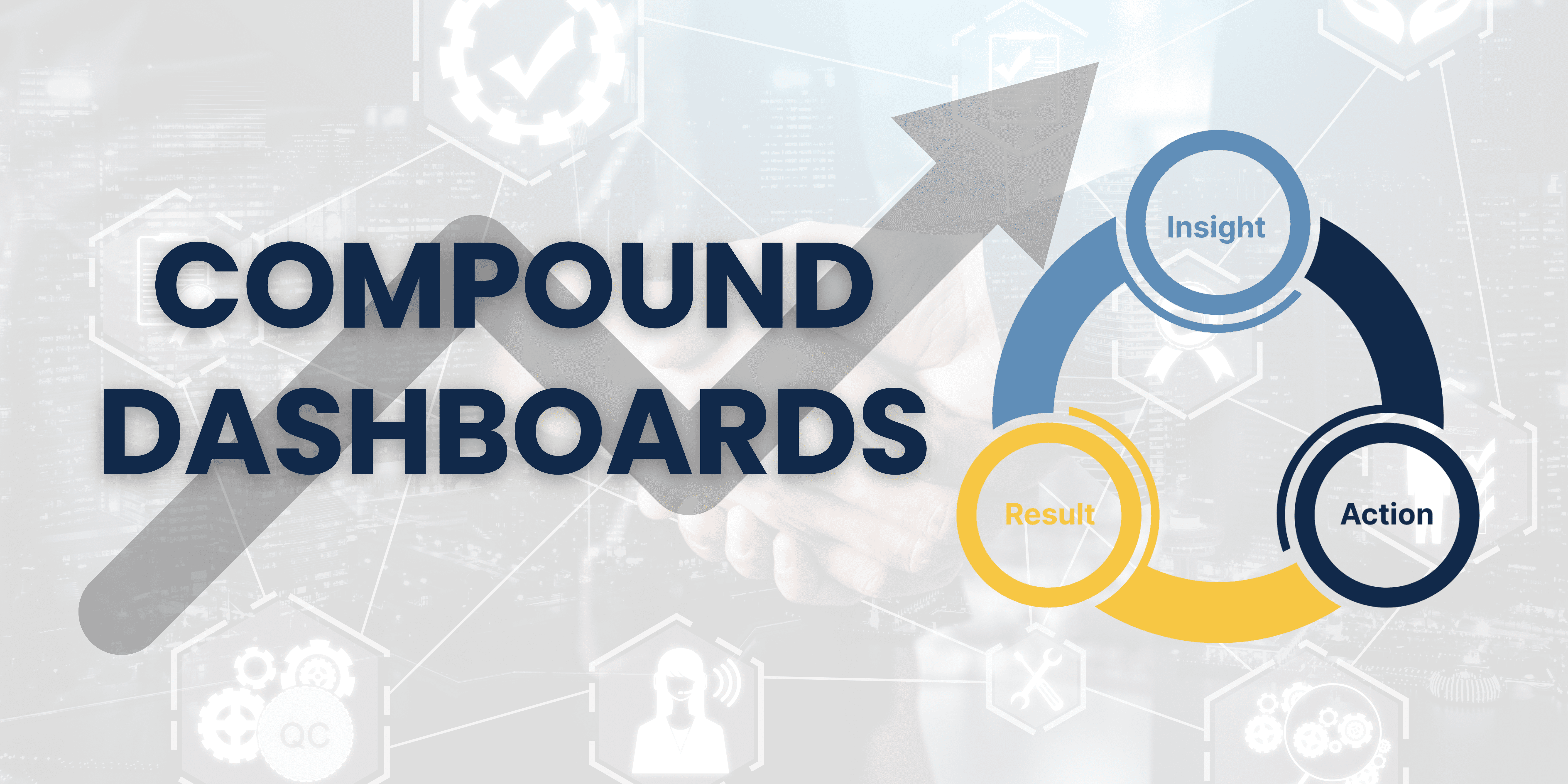
And when you track those shifts over time, you start to see something powerful: dashboards that don’t just monitor performance – they generate it.
Tiny insights. Real decisions. Measurable change.
If you want to move beyond “useful” dashboards and build ones that actually earn their keep, you need to stop thinking of them as products and start thinking of them as performance engines.
Engines that reveal friction.
Engines that prompt action.
Engines that support a feedback loop between what’s happening and what needs to happen next.
That’s when dashboards start to drive compounding improvements – not just better visibility, but actual business impact. The kind you can track and build on.
If you can design a dashboard that prompts even one meaningful improvement every week – a better allocation of resource, a quicker fix to a recurring issue, a small shift in behaviour – then you’ve built something that can change the trajectory of a team over time.
The structure behind the quiet gains
This isn’t magic. It’s process. And it’s exactly what the Powerful Dashboards Framework is designed to support.
Let’s take a quick look at how this approach ties in:
🔧 Turbocharged Build
- Scope Agreed: The dashboard is designed to serve a purpose. You’re not just visualising data – you’re supporting a decision.
- Templates Selected: That clarity of intent is reflected in every layout and interaction. You’re not starting from scratch; you’re building with intent.
🧠 Fast-Track Learning
- Great Charts: The insights aren’t buried. They’re visible. Understandable. Useful.
- Interactive Dashboard: Users can explore, compare, and drill down – all without needing a PhD in Tableau.
🛠️ Quality Confidence
- Best Practice Applied: The design encourages clarity, not confusion. People trust what they see.
- Peer Reviewed: It’s not just you in a vacuum – your logic has been sense-checked. Your assumptions have been tested.
- MVP Published: You didn’t wait until it was perfect. You launched. You learned. You adapted. You also have a plan to track improvements implemented and the results they deliver.
That’s how you build dashboards that actually do something.
Tracking the gains (so they don’t get lost)
Of course, none of this compounds unless you’re keeping track. And this is where most organisations fall short.
A dashboard highlights an issue.
A change gets made.
But the impact? It disappears into the ether.
If you’re serious about creating dashboards that deliver real returns, you need to build a habit of documenting the connection between insight → action → outcome.
That might mean a simple running log:
- “Spotted issue in X – raised with Y – fixed on Z”
- “Revenue dip tied to pricing – adjusted strategy – +3% by next cycle”
- “Repeat process delays in ops – surfaced by dashboard – launched new SOP”
It doesn’t have to be fancy. But it has to be intentional.
Because that’s what allows you – and your stakeholders – to see the bigger story over time: this dashboard doesn’t just report on the work. It shapes it.
So what’s the real game?
It’s not about aesthetics. It’s not about building the most complex dashboard in the room. And its certainly not about recreating what they currently do, but in Tableau.
It’s about building something that creates consistent, compounding wins – even if they’re small. Especially when they’re small.
In Atomic Habits, James Clear explains how micro improvements rarely feel dramatic in the moment. But over time, they shift your trajectory entirely. One smart change here. A small fix there. Week after week, they add up to something you can’t ignore.
That’s the game.
And it’s not loud. It’s not flashy.
An operational dashboard doesn’t need to wow the C-Suite in a demo.
But it does need to work. Help people find and implement those improvements. Consistently.
Every time the dashboard gets used – and acted on – its value grows.
If you can help your team improve even one thing a week, by just 1%, and you can trace that back to a dashboard you built…
You’re not just delivering charts.
You’re delivering transformation – one quiet, compounding insight at a time.
👋 Want to build dashboards that compound?
I am excited to announce that Dawn Harrington and myself have just opened enrolment for the Tableau Intermediate Bootcamp – a live, cohort-based programme built for analysts who already know the basics… but want to deliver dashboards that drive real, measurable outcomes.
In this pilot round, you’ll get:
- Three live Zoom sessions (with recordings)
- Hands-on assignments and real-time feedback
- A small group setting, so you’re not lost in the crowd
- One-to-one coaching support after the course
- Access to proven templates and ready-to-use dashboards you can drop into live projects
We’re running this round as a pilot – which means a lower price, more personal attention, and the chance to help shape how this programme evolves.
👉 View the full details and join here
You’ll leave with dashboards that don’t just show performance – they shape it.
Appendix: Research and References
The Diary of a CEO – Rule #8: “The Invisible Game Is the Only One Worth Playing”
Bartlett highlights the quiet habits and long-term mindset of true performers.
Atomic Habits by James Clear – https://jamesclear.com/continuous-improvement
1% improvements daily → 37x better outcomes in a year. It’s not about drama. It’s about direction.
Kaizen & Continuous Improvement Models
Iterative improvement models like PDCA (Plan-Do-Check-Act) and Kaizen match perfectly with dashboard use cycles.
This article was featured in Tableau’s Weekly Roundup.


