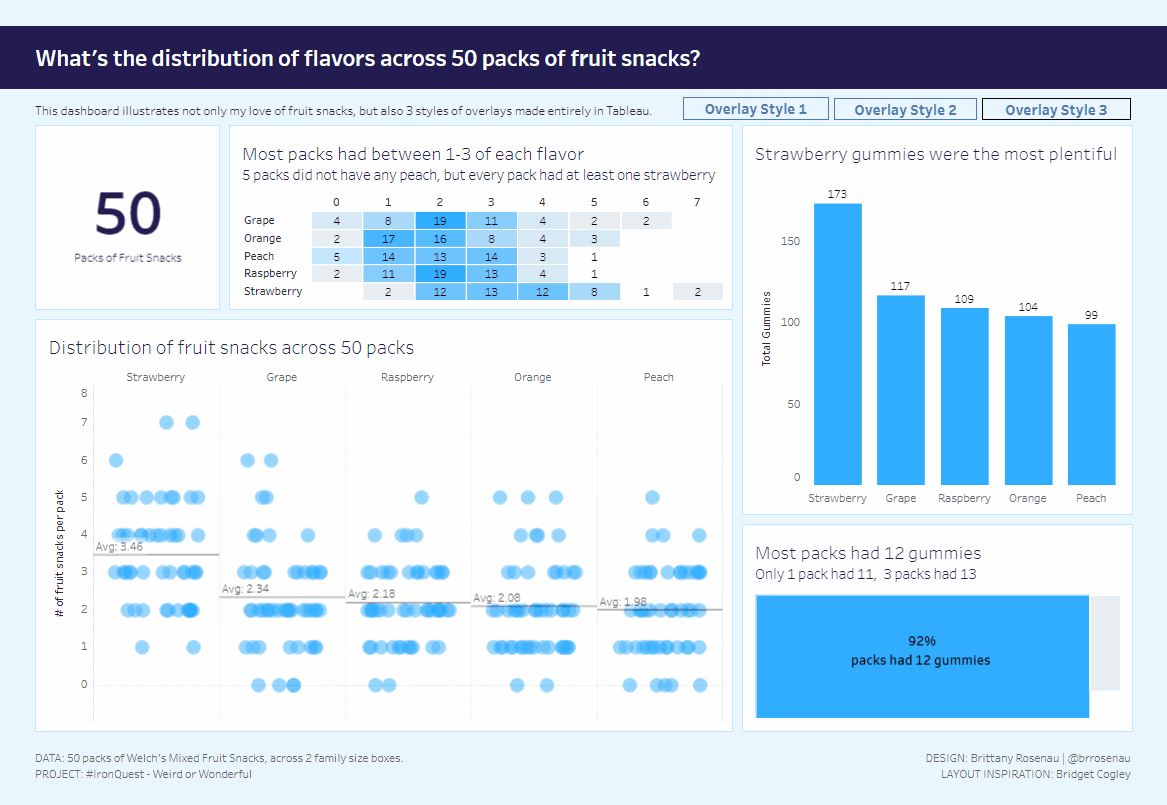
If you’re eager to elevate your Tableau dashboards with unique and interactive elements, Brittany Rosenau‘s article is an essential read. Her guide teaches you how to design an eye-catching dashboard overlay directly within Tableau – enhancing the user experience without relying on external tools or complex workarounds. Whether you want to emphasise important insights or create a more polished look, she walks you through the entire process, making it accessible for both beginners and experienced Tableau users.
What makes this article stand out is its practical application and creative approach. Brittany not only explains the technical steps but also shares valuable tips on when and why to use overlays in your dashboards. By mastering this technique, you’ll be able to deliver dashboards that are not only visually-appealing but also more engaging for your audience. If you’re looking to add a professional touch and more dynamic interactions to your Tableau work, this tutorial is the perfect!


