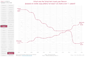
For last week’s #MakeoverMonday on “Ranking the States by Fiscal Condition” I created a bump chart showing the total net assets per person for each state based on
each state’s population. The curvy bump chart was created using Kevin Flerlage’s excellent Excel template, which you can read all about in his detailed blog post here ⇨
bit.ly/BumpChart.This post will focus on the selection panel to the left of the bump chart that allows you to select a state (or states) and have that state
highlighted in the bump chart, which was created with a couple of formulas and a set action.
Creating a Selection Panel with Set Actions By Marc Reid
Want to Get Latest Updates and Tips on Tableau Bites Blogs
Sign Up For Newsletter


