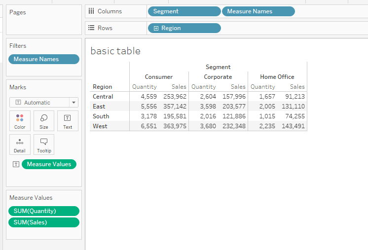
This article, by Jim Dehner, is one you shouldn’t miss. His post breaks down the often-overlooked details of formatting – providing tips that can instantly make your visualisations more polished and user-friendly. He explains how custom formatting can enhance the readability of your charts and graphs – helping your audience easily grasp insights from your data. Whether you’re looking to adjust fonts, colours, or layout, these techniques can dramatically improve the aesthetic appeal and functionality of your dashboards.
Beyond aesthetics, the article also delves into how formatting can impact the overall user experience. Jim highlights practical strategies for customising tooltips, labels, and other design elements to make your dashboards more intuitive. Don’t miss out on this opportunity to boost your Tableau skills and deliver visually-stunning dashboards that effectively communicate your data story.


